When it comes to web design, the perfect colour scheme can make or break the user experience. If you’re looking to create a website that stands out, you’ll need to invest time and thought into choosing the right combination of colours. It’s not always easy, but with the right techniques and resources, you can make sure your site is visually appealing, cohesive, and innovative. In this article, you’ll learn the basics of colour theory, discover tips for creating a colour scheme that stands out, and explore examples of successful colour palettes in web design. So, let’s get started!
Introduction to colour schemes in web design
When it comes to web design, using the right colour scheme can make a big difference – even if you don’t feel like you have an eye for design. When it comes to creating a stunning website, the right colour scheme is key. Colour schemes can help set the overall tone and mood of your website, as well as make it stand out from the competition. The key to a great colour scheme is to make sure it reflects the values of your brand and the message you want to convey to your audience.
To create the perfect website colour scheme, you’ll need to understand the basics of colour psychology and colour theory. It’s important to understand the different colour palettes and how to use the colour wheel to create a harmonious colour scheme. Colour psychology can help you understand how different shades and hues can evoke different emotions in people. It’s also important to consider the cultural context of your website and how the colours you choose may be interpreted by different audiences.
When you’re ready to create a website colour scheme, it’s helpful to look at examples of other websites for inspiration. Try to find websites that have a similar aesthetic or message to yours. You can also use tools like Adobe Color to create a unique colour palette. Once you have a general idea of the colour palette you want to use, you can use the colour wheel to create a harmonious colour scheme and experiment with different shades and hues until you find the perfect combination for your website.
The importance of a well-thought-out colour scheme
Crafting a well-considered colour palette for your site is essential for creating an impactful and memorable experience for your visitors. With the right colours, you can set a tone that resonates with your target audience. The combination of colours you choose should be carefully considered to ensure they bring out the best in each other. For example, bright blues can add a sense of openness and freshness to a website, while dark blues can create a sense of trust and reliability. Light oranges can give a website a warm and inviting feel, while a primary colour can be used to create a bold feature colour.
Choosing the right colour scheme for your website will help you create an atmosphere that resonates with your visitors. If done correctly, the colours should complement each other, creating an overall pleasant experience. Consider the emotions you want to evoke in your audience and the overall atmosphere you want to create before deciding on your colour scheme.
It’s also important to consider the context and purpose of your website before picking a colour palette. For example, a website for a financial advisor would have a much different colour scheme than a website for a children’s clothing store. Taking all these elements into account will help you create a colour scheme that is both visually appealing and effective.
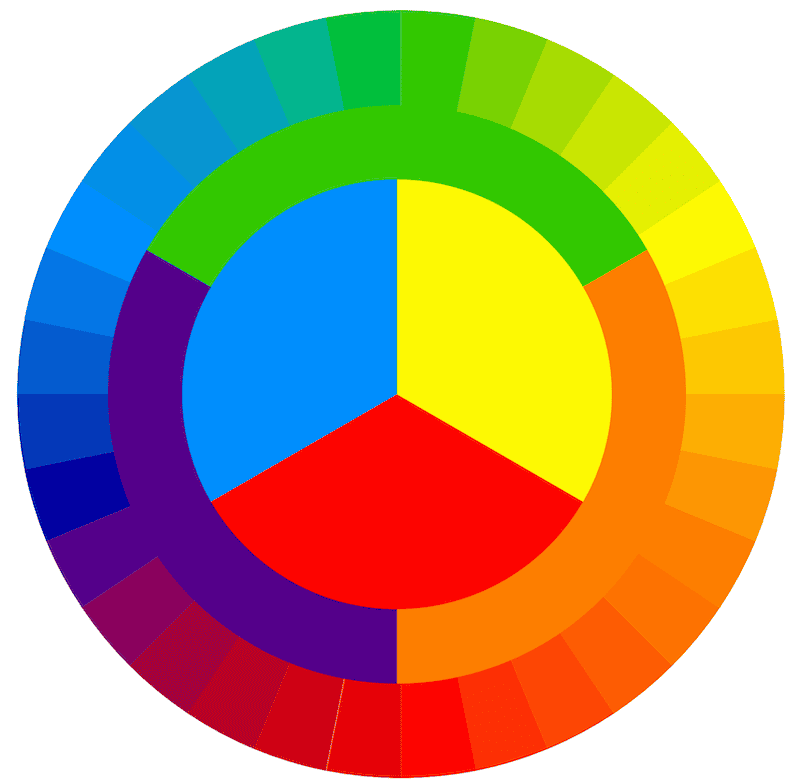
Understanding colour theory
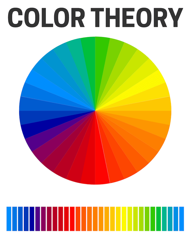
Creating a colour palette that works well together requires understanding colour theory and the colour wheel–visualizing how hues, shades, and tints complement one another. Having knowledge of the colour wheel and how to use it properly will help you to make decisions that bring out the best in your website design. It’s all about finding the right balance between hues and shades, as well as which colours will work together in harmony.
A colour wheel is a tool that can be used to identify complementary colours, analogous colour schemes, and monochromatic colour schemes. Complementary colours are opposite of each other on the wheel and can be used to create a high-contrast look. Analogous colour schemes are made up of colours that are adjacent to each other on the wheel and can be used to create a harmonious effect. A monochromatic colour scheme uses one hue and different tints and shades of that hue.
When designing your website, it’s important to look at the colour wheel to determine which colours will work best together. You should also consider the tone and mood you want to create and how that can be achieved with a well-thought-out colour scheme. Knowing how to use the colour wheel and colour theory can help you create a visually appealing website that is sure to leave a lasting impression.
Primary, secondary, and tertiary colours in web design
You can use primary, secondary, and tertiary colours in your web design for maximum impact. Did you know that 94% of first impressions are based on the design of a website? Having the right colours can make all the difference when it comes to creating a visually appealing and user-friendly website.
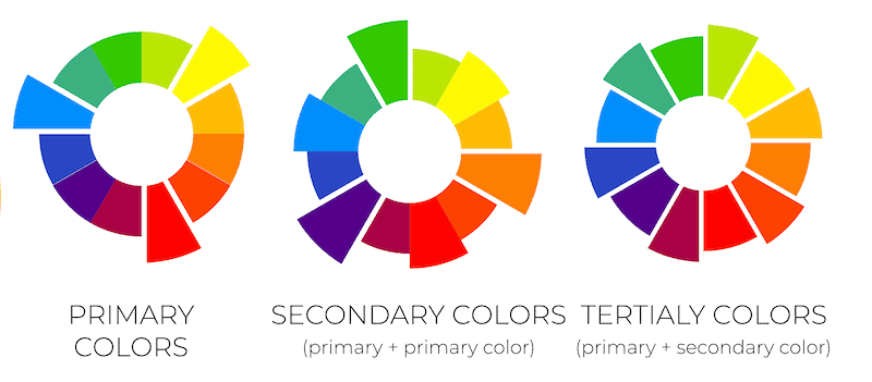
Primary colours are the base of any colour scheme and are the most important to consider when developing a website design. Primary colours are the ones that come straight from the colour wheel and include red, yellow, and blue. These colours are the foundation of any website design and can be used as your website’s main colour or background.
Secondary colours are created by combining two primary colours together. These colours can be used to enhance your website design and add contrast and depth to your design. Popular examples of secondary colours are green, purple, and orange. When used in moderation, these colours can be a great way to add some visual interest to your website.
Tertiary colours are what you get when you mix a primary colour with a secondary colour. These colours are usually less intense than primary or secondary colours and can be used to create a softer, more subtle look. Popular examples of tertiary colours are yellow-orange, red-purple, and blue-green. These colours can be used to create a calming atmosphere and make your website feel more inviting.
Using primary, secondary, and tertiary colours in your website design is a great way to create an eye-catching and inviting website that will make an excellent first impression. By understanding the basics of colour theory and the colour wheel, you can create a website design that will be both visually appealing and user-friendly.
Colour harmony and balance
Getting the right balance of colours in your design is essential for creating an eye-catching website that stands out from the crowd. Here are some tips to help you get the perfect colour combinations for your website:
- Use a dark background with a bright accent colour to create contrast and a visually pleasing combination.
- Explore colour palettes online to find the perfect blend of colours that will set your website apart.
- Experiment with bright colours to create a vibrant, energetic look.
- Consider using a muted palette with pastel colours for a more calming aesthetic.
With the right colour combination, you can create a stunning website that’s sure to leave a lasting impression on your visitors. Finding the perfect balance of colours is the key to creating an eye-catching website that stands out from the crowd.
Warm colours vs cool colours
Choosing the right mix of warm and cool colours can help set the mood of your site, and you don’t have to be a professional designer to do it – anyone can experiment with colour to create a great look. When building your website colour scheme, it’s important to consider the emotional impact of the warm and cool colours you choose. Warm colours, such as red, orange and yellow, are energizing and stimulating, while cool colours, such as blue, green, and purple, create a calming, peaceful atmosphere. By selecting the right mix of warm and cool colours for your website colour palette, you can create a visually appealing and emotionally engaging website that resonates with your brand colours.
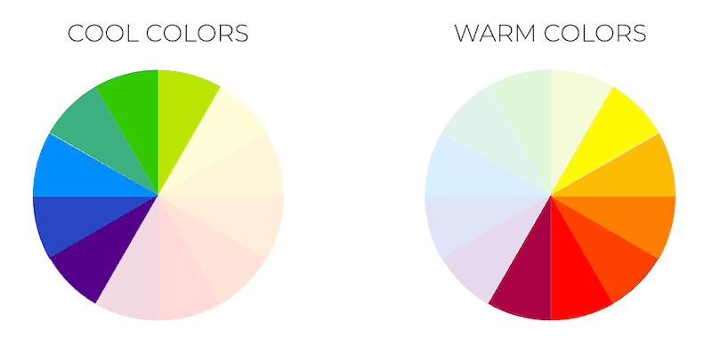
When selecting a website colour scheme, it’s important to ensure that the colour palette works harmoniously together. You should select colours that complement each other, as well as colours that contrast with each other, to create a visually stimulating website. For example, if you choose to use a warm colour like red, you could pair it with a cool colour like blue or green to create a vibrant, eye-catching look. Alternatively, you could combine a warm colour like orange with a cool colour like purple to create a more subtle, calming look.
No matter what website colour palette you choose, it’s important to remember that the colours you use should reflect the personality of your brand and the feelings you want to evoke. By selecting the right combination of warm and cool colours, you can create a visually appealing and emotionally engaging website that resonates with your target audience.
Tints, Shades and Tones
Tints, shades, and tones are essential components of colour theory that allow designers to create variations of colours for their designs. Each one is created by adding specific elements to a base colour, offering a range of possibilities that can be used to enhance the visual appeal and depth of a colour scheme.
Tints are created by adding white to a base colour, resulting in a lighter version of the original hue. This process can produce a range of pastel-like colours that are often associated with softness, calmness, and tranquillity. On the other hand, shades are formed by adding black to a base colour, which makes the hue darker and richer. Shades can evoke a sense of depth, sophistication, and elegance in a design. Lastly, tones are generated by adding grey to a base colour, which balances the hue and creates a more subdued, muted version of the original colour. Tones are particularly useful for achieving a harmonious and balanced look in a colour scheme, as they tend to be less intense than pure hues or shades.
Monochromatic colour schemes: Simplicity and elegance
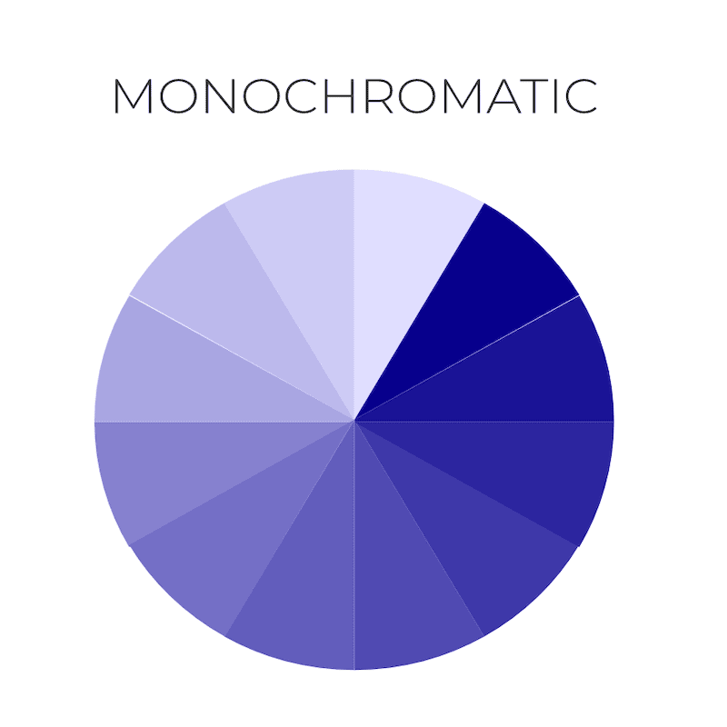
If you’re looking to create a website that exudes a unique and sophisticated look, a monochromatic colour scheme may be the perfect choice. Monochromatic colour schemes, also known as muted palettes, provide a sophisticated look through the use of one colour with several different shades and tones. This type of scheme uses a monotone colour palette and can instantly create an inviting atmosphere for your website.
For example,
- Blue Monochromatic
- Lightest: Light Blue
- Light: Sky Blue
- Base colour: Blue
- Dark: Royal Blue
- Darkest: Navy Blue
- Red Monochromatic
- Lightest: Pink
- Light: Salmon
- Base colour: Red
- Dark: Crimson
- Darkest: Maroon
- Green Monochromatic
- Lightest: Mint Green
- Light: Light Green
- Base colour: Green
- Dark: Forest Green
- Darkest: Dark Green
Here are 4 reasons why you should consider using a monochromatic colour scheme for your website:
- It creates a unified, elegant look.
- It is easy to implement.
- It can add subtle texture and depth to your website design.
- It can create an inviting atmosphere with delicate shades.
Monochromatic colour schemes are a great way to create a sophisticated, unified and elegant look for your website. It is easy to implement and provides subtle texture and depth to the design. Plus, you can create an inviting atmosphere with delicate shades and tones of the same colour.
Analogous colour schemes: Harmony with adjacent colours
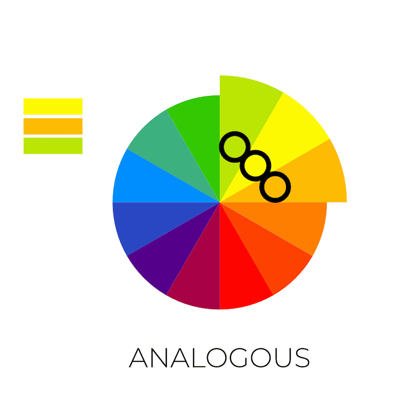
Experience the harmony of adjacent colours by using an analogous colour scheme on your site! Analogous colour schemes are a great way to create a harmonious colour combination for your own website colour scheme. This type of colour scheme consists of colours adjacent to each other on the colour wheel, creating a sense of unity and balance.
Examples of analogous colour schemes:-
- Blue, Blue-Green, and Green
- Red, Red-Orange, and Orange
- Yellow, Yellow-Green, and Green
With the use of analogous colours, you can use the same colour palette to create a complementary colour scheme that will give your website a professional, unified look.
Using an analogous colour scheme is a great way to add a touch of sophistication to your website. You can experiment with different shades of the same colour to create a unique combination that will give your website a distinct feel. By combining colours that are similar in hue, you can create a cohesive look that will be both pleasing to the eye and aesthetically pleasing.
Your own palette should be a reflection of your website’s purpose and design. With the use of an analogous colour scheme, you can create a colour combination that will bring out the best elements of your website. By using colours that are similar in hue, you can create a unified look that will make your website stand out. With the use of analogous colour schemes, you can create a harmonious colour combination that will give your website a professional, unified look.
Complementary colour schemes: Contrast and boldness
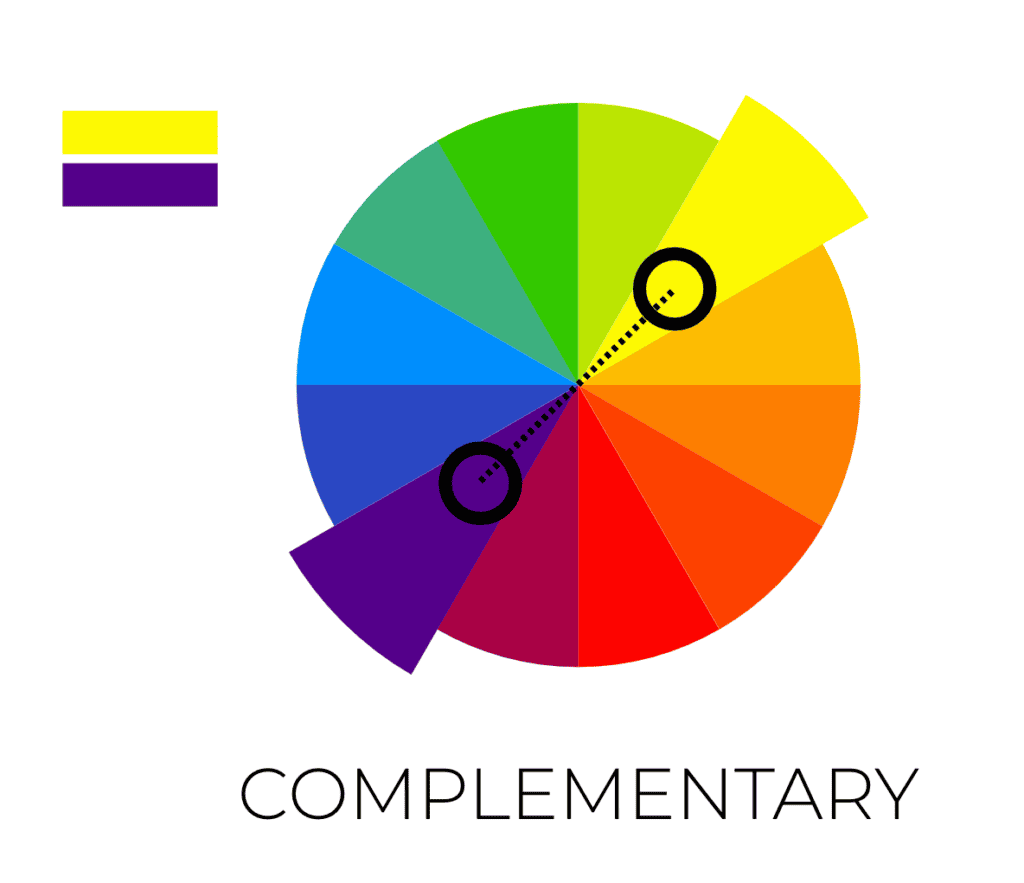
Embrace the boldness of contrasting colours with a complementary colour scheme – it’s sure to make your website stand out like a diamond in the rough! A complementary colour scheme is made up of colours that are opposite one another on the colour wheel, such as dark grey and bright yellow. With this type of colour scheme, you can create an eye-catching contrast with a bright colour palette.
You can use these examples of complementary colours:-
- Blue and Orange
- Red and Green
- Yellow and Purple
The colours will be stunning, but be sure to use white space to break them up.
A complementary colour scheme can be used to create a modern, edgy design. It can also add a sense of excitement to your website. These colours will draw the eye of your visitors, so be sure to use them sparingly. When using a complementary colour scheme, it’s important to choose colours that are in the same tonal range. This will create a balanced look and help keep the colours from clashing.
When using complementary colours, you can create a vibrant and exciting website. This type of colour scheme can also be used to create an eye-catching design that stands out from the crowd. Keep in mind that a complementary colour scheme can be too much if you don’t use white space and tonal colours to break it up. By doing this, you can create a stunning website that will draw the attention of your visitors.
Split complementary colour schemes: A twist on contrast
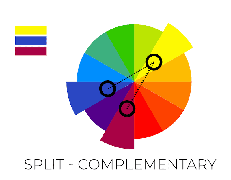
Add a twist to your website’s contrast with a split complementary colour scheme – it’s sure to make it stand out! Split complementary colour schemes are a great way to add a unique flair to your website while also achieving a vibrant look. This scheme consists of a primary colour, a secondary colour, and a tertiary colour.
Here are three examples of split complementary colour schemes:
- Blue, Orange-Yellow, and Orange-Red
- Base colour: Blue
- Complementary colour: Orange
- Split complements: Orange-Yellow and Orange-Red
- Green, Red-Orange, and Red-Purple
- Base colour: Green
- Complementary colour: Red
- Split complements: Red-Orange and Red-Purple
- Yellow, Blue-Purple, and Blue-Green
- Base colour: Yellow
- Complementary colour: Purple
- Split complements: Blue-Purple and Blue-Green
With this scheme, the bright tones of the primary and tertiary colours will stand out against the darker hue of the secondary colour. This can help create a bold, eye-catching design that reflects your brand’s personality.
To make your split complementary colour scheme work, you need to select the right colours and then use the right hex codes. Begin by selecting three colours that work together harmoniously. You’ll want to make sure the colours are distinct yet still blend together to create a cohesive look. After you’ve chosen the colours, you’ll need to find the corresponding hex codes. Hex codes are the characters’ strings used to define colours online. Once you have the hex codes, you can use them to set the colours for the website. An example of hex code for the colour white is #FFFFFF, and for the colour black is #000000.
It’s important to remember that you don’t have to use the same three colours for every page. With a split complementary colour scheme, you can add subtle variations to the colours for each page. This will give your website more depth and interest, making it stand out in visitors’ eyes. So go ahead – experiment and find the perfect split complementary colour scheme for your website!
Triadic colour schemes: Vibrant and balanced
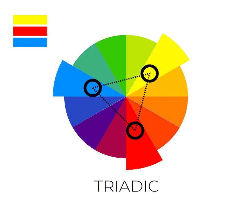
Enjoy the vibrant and balanced look of a triadic colour scheme – it’s a great way to make your website stand out! According to research, triadic colour schemes are the most popular choice for online designs, with 35% of websites using them in 2019. Triadic colour schemes are made up of three bold colours, usually chosen from the primary, secondary, and tertiary colours of the colour wheel. Typically, one colour will be a dominant hue, and the other two will be complementary colours.
Examples of triadic colour schemes:-
- Red, Blue, and Yellow
- Green, Orange, and Purple
- Blue-Green, Red-Orange, and Yellow-Purple
The best thing about triadic colour schemes is that they allow you to use bright, vibrant colours without overwhelming the viewer. By carefully choosing the right shades and tones of each colour, you can create a visually appealing design that will draw attention to the content of your website. For instance, a royal blue, bright green, and blue tones triadic colour scheme can be used to create an aesthetically pleasing design that will stand out from the competition.
When using a triadic colour scheme, it is important to remember to use shades and tones of each colour that complement each other. This will ensure that your website looks balanced and professional. It is also important to use a combination of light and dark shades to create visual interest and depth. By carefully choosing the right colour palette for your website, you can create a look that is both vibrant and balanced.
Tetradic colour schemes: Richness and variety
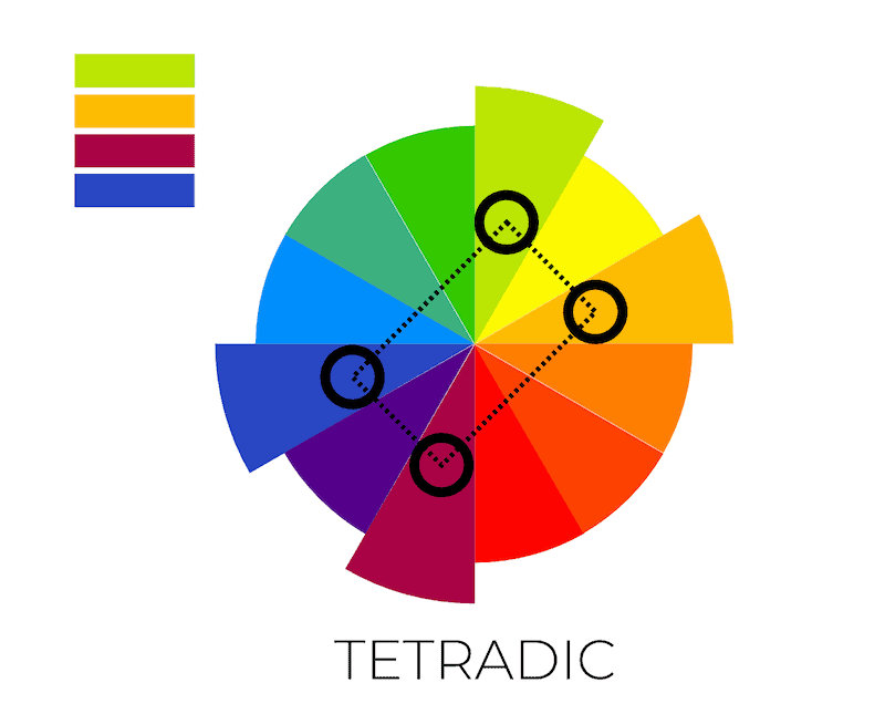
Indulge in the richness and variety of a tetradic colour scheme to add a level of sophistication to your design. Tetradic colour schemes are composed of four colours in two complementary pairs; this colour scheme provides a great opportunity to make a bold statement with your design. Its vibrant colours create a dynamic and balanced look that is pleasing to the eye. Here are four ways to use a tetradic colour scheme to create a stunning website:
- Create a blue colour scheme – Use a blue colour scheme as the base for your website, and then add two complementary colours to create a vibrant and balanced look.
- Choose accent colours – Select one or two accent colours that will draw attention to your website and create a visually appealing design.
- Add muted colours – This colour scheme works best when you add muted colours to balance out the vibrant colours and create a harmonious look.
- Experiment with different combinations – Try out different combinations of colours to find the perfect tetradic colour scheme for your website.
Here are three examples of tetradic colour schemes:
- Blue, Orange, Green, and Red
- First pair: Blue and Orange
- Second pair: Green and Red
- Yellow, Purple, Blue-Green, and Red-Orange
- First pair: Yellow and Purple
- Second pair: Blue-Green (also known as teal or turquoise) and Red-Orange (also known as vermilion or coral)
- Red, Green, Yellow-Orange, and Blue-Violet
- First pair: Red and Green
- Second pair: Yellow-Orange (also known as gold or amber) and Blue-Violet (also known as indigo or periwinkle)
A tetradic colour scheme can be a great way to add interest and visual appeal to your website. With its vibrant colours and balanced look, it provides a unique way to make a bold statement with your design. Take the time to experiment with different colour combinations to find the perfect colour scheme for your website.
Integrating your brand identity
One of the key aspects to consider when choosing a colour scheme for your website is how it aligns with your brand identity. Your brand colours play a significant role in representing your company’s values, personality, and overall image. Therefore, integrating these colours into your website design helps create a cohesive and consistent look that resonates with your target audience.
To begin the process of incorporating your brand identity, start by identifying the primary colours associated with your logo or other marketing materials. These colours will form the basis of your website’s colour scheme and should be used strategically throughout the design. In addition to your primary brand colours, you can also consider incorporating secondary and accent colours that complement your main hues while still reflecting your brand’s essence.
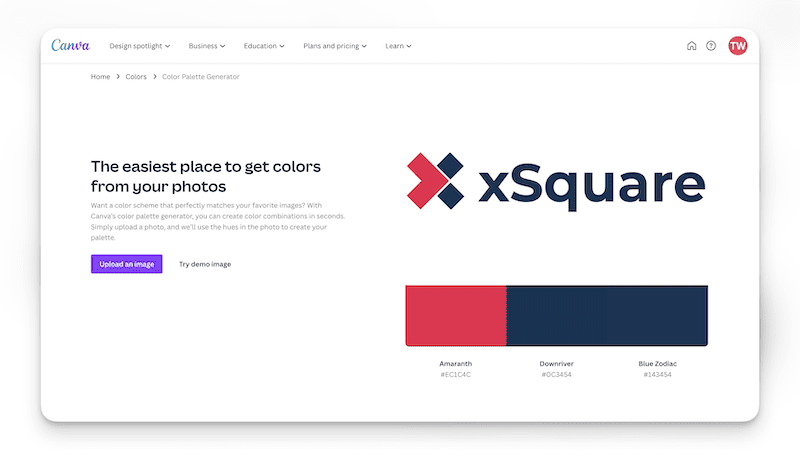
If you don’t already know your brand’s colours, try using Canva’s Color Palette Generator feature, where you upload your logo image. It will recommend a colour palette to be used based on the uploaded image.
Remember that consistency is crucial when it comes to brand identity. By maintaining a unified colour scheme across your website, social media profiles, and other marketing channels, you create a memorable and recognizable brand experience for your audience. This not only enhances the aesthetic appeal of your website but also contributes to building trust and credibility with your users.
Considering your target audience: Age, gender, and cultural factors
When creating a website, consider your target audience’s age, gender, and cultural factors to ensure the design resonates with them. Your colour scheme for your website should be chosen with these considerations in mind, as the wrong choice could result in a failed attempt to engage with your audience. For instance, if your target audience is older, a website’s colour palette with classic blue and earthy tones may be more appropriate than a brighter, more vibrant hue. Alternatively, a colour palette with brighter, more vibrant hues may be a better choice if you are targeting a younger audience.
Your target audience’s age, gender, and cultural factors should also determine the type of colour scheme you choose. For example, if you’re targeting a culturally diverse audience, a colour palette with a broad range of shades can help you create a design that is universally appealing. Additionally, if you’re looking to create brand recognition, choosing a colour scheme that’s consistent with your brand’s core values and colours can help foster loyalty and recognition among your target audience.
Here’s a general guideline you can refer to on colours that resonate with the age, gender and cultural factors of your audience:-
Age group | Gender | Cultural Factors | Colors | Notes |
Children | Both | Western, Eastern | Bright colors: Red, Yellow, Green, Blue, Orange, Pink | Children are generally attracted to bright, bold colors, which evoke energy and playfulness. |
Teenagers | Both | Western, Eastern | Vibrant and trendy colors: Teal, Purple, Lime Green, Coral | Teens often prefer colors that reflect their individuality and follow current trends. |
Adults | Male | Western | Classic and muted colors: Blue, Gray, Green, Brown | Men in Western cultures often gravitate towards classic and neutral colors. |
Adults | Female | Western | Soft and sophisticated colors: Purple, Turquoise, Pink, Pastels | Women in Western cultures may prefer softer, more sophisticated hues |
Adults | Both | Eastern | Traditional and symbolic colors: Red, Gold, Green, White | Eastern cultures may have strong associations with colors tied to tradition and symbolism. |
Seniors | Both | Western, Eastern | Calm and gentle colors: Light Blue, Beige, Lavender, Pale Yellow | Older adults may appreciate calm, gentle colors that evoke a sense of peace and tranquility. |
Please note that these colour preferences can vary significantly among individuals within each group and may not apply universally. When selecting colours for your website or marketing materials, it is essential to consider your target audience, as their personal preferences and cultural backgrounds may influence their perceptions of different hues.
Researching your specific audience can help you make informed decisions about the most appropriate colour choices for your project. One quick cheat sheet is to find out the favourite magazine your audience reads and look at the colour scheme the magazine uses.
Choosing the right colour scheme for your website is essential in creating a design that resonates with your target audience. Keeping in mind the age, gender, and cultural factors that make up your target audience can help you create a design that will stand out and engage your audience.
Colour psychology: Evoke emotions and drive user engagement

Now that you have integrated your brand identity into your website design, it is time to focus on the next step: colour psychology. Colour psychology is an important part of the web design process as it can evoke emotions and drive user engagement. Here is a list of colours to consider when creating a website colour scheme:
Colour | Associated Emotions and Meanings |
Red | Passion, excitement, energy, urgency, danger |
Orange | Warmth, enthusiasm, creativity, friendliness |
Yellow | Happiness, optimism, positivity, caution |
Green | Nature, growth, balance, stability, freshness |
Blue | Trust, calmness, reliability, professionalism |
Purple | Luxury, royalty, creativity, spirituality |
Pink | Romance, femininity, gentleness, softness |
Brown | Earthiness, reliability, comfort, stability |
Black | Power, sophistication, elegance, mystery |
White | Purity, cleanliness, simplicity, minimalism |
Gray | Neutrality, balance, sophistication, formality |
Gold | Wealth, luxury, success, high-quality |
Silver | Elegance, modernity, sleekness, high-tech |
Please note that the psychology of colours can vary across different cultures and contexts. It is essential to consider your target audience when selecting colours for your website or marketing materials, as their perceptions may differ from the general associations listed in this table.
By using a combination of colours that are pleasing to the eye and evoke the emotions you want to convey, you can create an aesthetically-pleasing website that will engage your users. To ensure the highest level of user engagement, it is important to consider colour psychology when creating a website colour scheme. With an understanding of the emotions different colours evoke, you can create a website colour scheme that resonates with your audience and inspires them to engage with your website.
Readability and accessibility
Creating a website that is both readable and legible is essential for ensuring accessibility and user engagement – making colour choice a crucial part of the process. When picking a colour scheme for a website, readability and legibility should be top of mind. Poorly chosen colour combinations can make it difficult for users to read the content, resulting in decreased engagement. On the other hand, well-chosen colours can create a visually appealing and accessible experience.

It’s important to consider the contrast between text and background colour when picking a colour scheme. Too little contrast can make the text difficult to read, while too much contrast can be too harsh and uncomfortable on the eyes. Finding the right balance can be tricky but can be made easier with tools that analyze the readability of the text and colour combinations.
Here are some examples of colour combinations that are recommended for accessibility:-
Background Colour | Text Colour | Benefit |
White | Black | High contrast, easy to read, universally accessible |
Black | White | High contrast, clear visibility, professional |
Light Gray | Black | Good contrast, easy to read, neutral |
Dark Gray | White | Good contrast, clear visibility, modern |
Light Blue | Dark Blue | Sufficient contrast, visually appealing, trustworthy |
Dark Green | White | Good contrast, easy to read, associated with nature |
Dark Blue | Light Yellow | High contrast, visually striking, engaging |
These colour combinations are advisable for accessibility due to their high contrast and complementary hues, making it easier for users to read and understand the content. When selecting colours for your website, prioritize high contrast between text and background colours and consider the psychological associations of the chosen colours.
Here are some examples of colour combinations that usually fail accessibility tests:-
Background Colour | Text Colour | Issue |
Red | Green | Low contrast, difficult to read, clashing hues |
Blue | Purple | Low contrast, poor visibility |
Yellow | White | Low contrast, poor readability |
Light Gray | White | Low contrast, difficult to read |
Dark Gray | Black | Low contrast, poor visibility |
Light Blue | Light Green | Low contrast, difficult to read |
Light Pink | Light Yellow | Low contrast, poor readability |
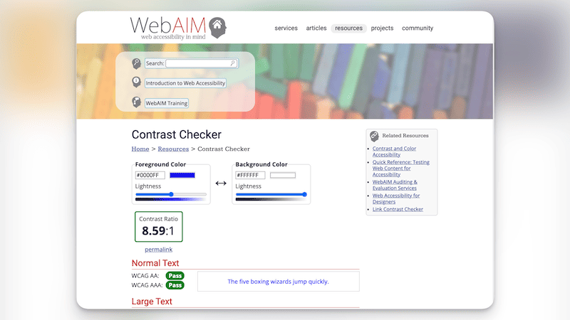
These colour combinations generally fail in accessibility due to low contrast and clashing hues, making it challenging for users to read and comprehend the content. When selecting colours for your website, it’s essential to prioritize high contrast between text and background colours and avoid combinations that may be problematic for users with visual impairments or colour blindness. Online tools like the WebAIM Color Contrast Checker can help ensure your chosen colours meet accessibility guidelines.
Tools and resources for choosing the perfect colour scheme
In today’s digital landscape, there are numerous online tools and resources available to help you create the perfect colour scheme for your business website. These tools not only simplify the process of selecting harmonious colours but also provide inspiration to refine your design ideas.
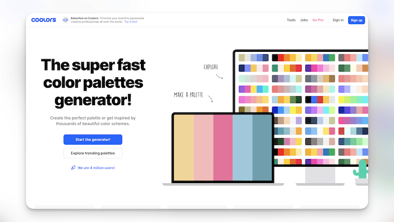
One popular resource for generating colour palettes is Coolors. This user-friendly tool allows you to quickly create, save, and share colour schemes based on various criteria, such as complementary or analogous colours. You can also upload an image to extract a colour palette from it, which can be particularly helpful if you’re looking to match your website’s colour scheme with your existing branding or marketing materials.
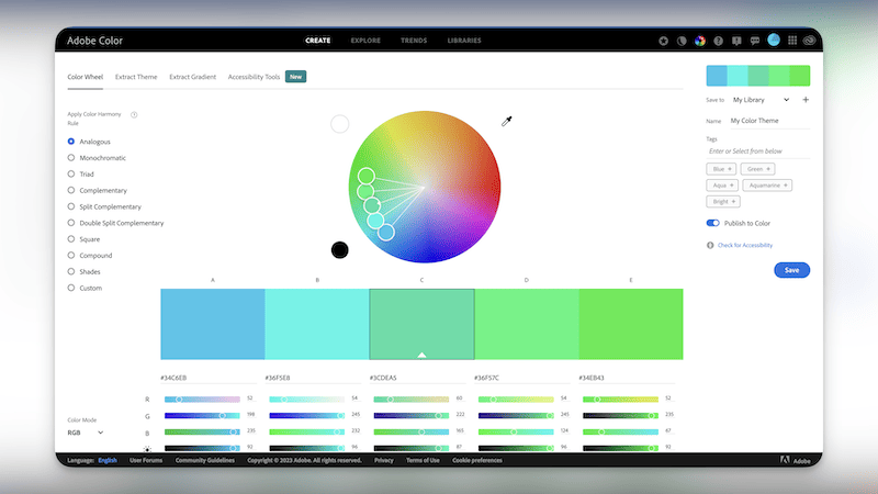
Another excellent resource is Adobe Color CC, formerly known as Adobe Kuler. This powerful tool enables you to create and explore colour schemes using an interactive colour wheel, allowing you to experiment with different colour relationships like complementary, triadic, and split-complementary. Additionally, Adobe Color CC offers a vast library of pre-made colour palettes created by other users, which can serve as inspiration for your own designs.
Also, don’t miss out on Canva’s Color Palette Generator feature. The fun part is you can upload an image, and it will recommend a colour palette to be used based on the uploaded image. This is useful as you can easily extract your brand colour’s scheme; if you don’t already know.
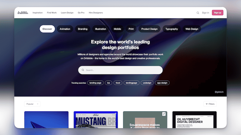
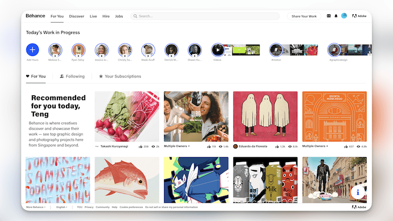
For those seeking a more curated approach, websites such as Dribbble and Behance showcase a wide range of design projects, including examples of successful colour schemes in web design. Browsing these platforms can provide invaluable insights into current design trends and help spark new ideas for your website’s colour palette.
When selecting colours for your website, remember to consider accessibility. Online tools like the WebAIM Color Contrast Checker can help ensure that your chosen colours meet the appropriate contrast ratios for text and background, making your website accessible to users with visual impairments.
By utilizing these online tools and resources, you’ll be well-equipped to choose the perfect colour scheme for your business website, creating a visually appealing and effective design that meets both your branding goals and user experience needs.
Creating a cohesive and visually appealing colour scheme
When it comes to creating a website, you have to be very mindful of the colour scheme you choose. Not only should it be visually pleasing, but it should also be cohesive and represent your brand. The examples of effective colour schemes in web design have shown you the importance of creating a colour palette that is both pleasing and professional. Now let’s look at how to create a cohesive and visually appealing colour scheme for your website.
When choosing a colour palette, you should consider the following factors: how many colours you’re using, the level of contrast between colours, and the overall mood or tone you are trying to create. To help you create a cohesive and visually appealing colour scheme, you can use the following table as a guide.
Colour | Uses | Mood |
Primary | Logos, Headings, Buttons | Bold, Professional |
Secondary | Navigation, Subheadings | Complimentary, Connective |
Accent | Highlighted Text, Icons | Eye-catching, Unique |
Using a combination of primary, secondary, and accent colours, you can create a visually appealing and cohesive colour scheme that reflects your website’s unique personality. Additionally, you can use tools such as Adobe Color CC or Coolors to help you experiment with different colour combinations until you find the perfect colour palette for your website. So, don’t be afraid to let your creativity shine as you work on creating a cohesive and visually appealing colour scheme for your website.
Frequently asked question
How many colours are advisable to be used on a business website?
For a business website, it is advisable to use a colour scheme consisting of three to five main colours. This typically includes one primary colour, one or two secondary colours, and one or two accent colours. Keeping the colour scheme relatively simple helps maintain visual harmony and prevents your website from appearing cluttered or overwhelming to users.
Which should be prioritised between using brand colours and accessibility?
Accessibility should be prioritized over strictly adhering to brand colours when designing for a diverse audience. Ensuring that your design is accessible to users with visual impairments, colour blindness, or other disabilities is crucial for creating an inclusive and user-friendly experience.
However, this doesn’t mean you have to compromise on maintaining your brand identity. You can strike a balance by making minor adjustments to your brand colours, such as tweaking the shade, tint, or tone to improve contrast and readability. Additionally, consider using other visual elements, such as typography, layout, and imagery, to reinforce your brand identity without relying solely on colours. By prioritizing accessibility while maintaining a consistent brand identity, you can create a more inclusive and engaging experience for all users.
Does Google penalise websites with poor accessibility on search rankings?
Google does not explicitly penalize websites with poor accessibility. However, a website with poor accessibility may cause a poor user experience and thus leads to a higher probability that a website visitor might exit your website or not read other content.
Conclusion
You’ve done it! You’ve created a colour scheme that complements your website’s content and style, and you’re proud of what you’ve accomplished. Just like a painter carefully selects their palette to create a masterpiece, you’ve crafted a colour scheme that’s sure to captivate your visitors. Data shows that a well-designed colour scheme can significantly impact website engagement and user experience. For example, websites with high-contrast colour schemes can increase user engagement by up to 20%. With the perfect colour scheme, you can create a website that’s both visually stunning and highly functional.