White space is a powerful tool in web design that can be used to create effective and eye-catching layouts. It can help you make a statement and draw attention to the important elements of your design. You don’t have to be a web designer to understand the basics of white space – it’s all about creating harmony and balance. In this article, we’ll explore how white space can be used to create stunning, effective web layouts.
By understanding the psychological effects of white space on user experience and learning how to incorporate it into your designs, you can take your web layouts to the next level. You’ll be able to give your designs a professional edge and create an engaging, intuitive experience for your users. So let’s get started and explore the role of white space in effective web layouts.
Introduction to white space in web design
You’re probably familiar with the idea of empty space in web design, but you might not know how it can be used to create an aesthetically pleasing and impactful design. White space, sometimes known as negative space, is the area between the visual elements on a page. It can range from micro white space between characters or paragraphs to macro white space between columns or sections. White space not only helps to create balance and structure but it also allows for the user to focus on a particular element without distraction.
By using white space in a web design, you can draw attention to certain elements, direct the user’s eye to certain points, and create an overall aesthetic that is pleasing to the eye. It can also help to create a sense of openness and readability to a web page by making it easier to navigate. Additionally, white space can be used to emphasize certain visual elements, such as images or text, by providing an area of contrast around them. White space is an important part of web design, and its use can elevate an ordinary website into something truly extraordinary. It can help to create an engaging and visually stimulating user experience that will keep visitors coming back for more. By understanding the role of white space in web design, you can take your web design skills to the next level.
Defining white space: Active and passive white space
Seeing how active and passive white space can be used to create an attractive and functional design is key to crafting successful web designs. Active space, or white space that is intentional and has a purpose can be used to draw attention to particular elements, create balance, and increase readability. Passive space, or white space that is unintentional, is the space between elements as a result of their size and scale. Both types of white space should be used together in web design to create an organized layout and a pleasant user experience.
When considering white space in web design, line spacing should be taken into consideration. Line spacing is the space between lines of text and is an important factor when constructing a cohesive user interface. Increasing the line spacing can make the text more readable and is a great way to put emphasis on a particular element, creating a visually appealing and easy-to-follow design.
A good web design should make use of both active and passive white space to create a balanced and visually interesting user interface. The judicious use of white space also increases the UX design, making the website easier to navigate and interact with. By combining active and passive white space, web designers can create an attractive and organized website that meets the needs of the user and the business.
The psychological impact of white space on user experience

The psychological impact of white space on user experience can be a powerful tool for creating compelling designs that draw users in and make them feel more at ease. White space can guide visitors’ eyes, leading them to specific focal points on the page. This can create a more visually interesting design while also ensuring that visitors notice the page’s most important elements.
White space can also be used to create a sense of openness and calm on a website. By introducing more white space, web designers can create a less crowded look, which can help reduce feelings of anxiety and confusion. This can be especially beneficial for websites centred around relaxation, such as health and wellness sites.
By utilizing white space strategically, web designers can create designs that are visually appealing while also making visitors feel comfortable and at ease. This can lead to more positive user experiences and higher user engagement, which is essential for any successful website.
Benefits of using white space in web layouts
By utilizing white space in your web layouts, you can create an effective design that appeals to your visitors and makes them feel comfortable. Don’t you want to give your users the best experience possible? Using the power of negative space, you can create a sense of calm and organization that will draw visitors in. By using micro white space, you can also create a visual hierarchy that will make it easier to navigate through your website. Additionally, a background image with plenty of white space can create a stunning visual effect that will draw attention to the call to action.
White space can also be used to create a sense of balance and proportion in your web layout. With a well-crafted white space design, you can make sure that all of the elements of your page are visually balanced and organized. This will help to create a sense of structure and purpose in your design, making it easier for users to find what they are looking for.
White space can also be used to make your web page look more modern and professional. By using white space, you can create a clean and minimalistic look that will draw attention to the important elements of your page. This will make your page look more attractive and inviting and will help to engage your visitors and encourage them to take action.
Creating balance and harmony with white space

Using white space strategically in your design can help create a sense of harmony and balance, making it easier for visitors to find their way around your page. White space is the part of the design that doesn’t contain text or visuals; it’s the area around the elements of your design that’s left blank. Micro white space is the small gaps between individual elements, such as the lines between words or the margins around paragraphs. When designing a web layout, it’s essential to consider the amount of white space you use to balance out the other elements. Too much white space can make a page look empty, while too little can make it look cramped.
When used correctly, white space can help bring out the key elements in your design. This includes the hero image and key design elements, as well as the text contents. Creating a sense of balance between these elements can make it easier for visitors to focus on the important parts of your page. It can also draw attention to the overall design layout, helping visitors get a better understanding of the page before them.
White space is an invaluable tool for web designers, as it can help create a sense of harmony and balance on the page. Rather than overwhelming the visitor with too many elements, white space can help organize the page and make it easier to navigate. If you’re looking to create an effective web layout, it’s important to consider how white space can help bring out the key elements in your design.
White space and typography: Enhancing readability and legibility

Now that you’ve established balance and harmony with white space let’s move on to how white space and typography can enhance readability and legibility. Of all the design elements on a web page, typography is the most important to creating a positive user experience.
When using white space and typography together, it’s important to remember the concept of micro white space. It’s the small gaps between lines of text, words, and letters and it gives users a moment of breathing room. The font size, line height, and letter spacing should be adjusted to create a comfortable reading experience and draw the user’s attention to the most important elements.
Using white space and typography in unison will make your web layout both aesthetically pleasing and user-friendly. It sets the tone for the user and can help them achieve their goals quicker. By making sure your web page has an easily readable design, you can ensure that your users will have a positive experience.
Using white space to guide user attention and create focal points

Creating a focal point with white space can be a powerful way to direct your audience’s attention and emphasize the importance of certain elements. By strategically using white space to emphasize key elements, you can draw your audience in and create a sense of focus. Consider using micro white space, or the space surrounding a particular element, to create a focal point. It’s important to remember that empty space can be just as important as the content itself. When used effectively, white space can be used to differentiate and prioritize elements on a web page and draw attention to the most important parts of the page.
When looking to use white space to create a focal point, consider the size, shape, and colour of the element you want to emphasize. Micro white space can be used to separate visual elements and create contrast between different elements. It’s also important to take into account the amount of space you use around each element, as this can further emphasize the importance of each element.
By using white space to create focal points, you can drive engagement and help your audience focus on the most important parts of your website. As a result, you can create a more user-friendly experience that is both visually appealing and functional. Taking the time to consider how white space can be used to enhance your website can help you create a more effective design.
White space and responsive design: Adapting layouts for various devices
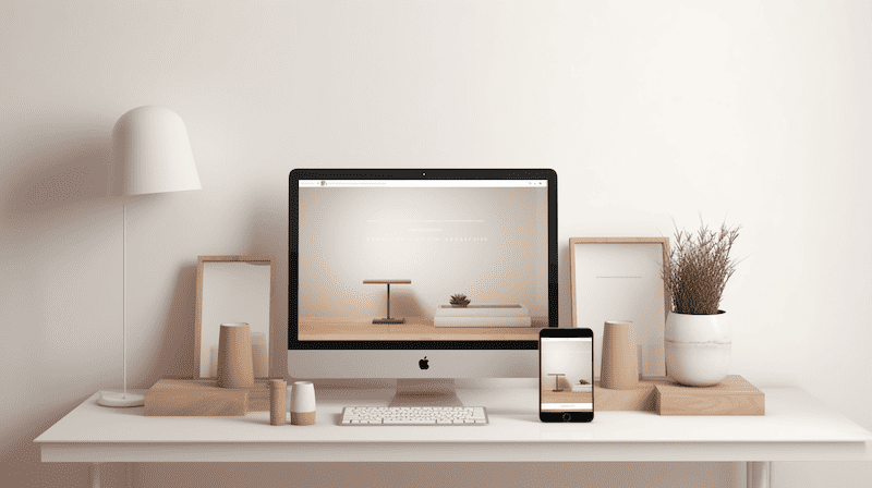
You can think of responsive design as a puzzle; white space is the key piece that helps the layout fit together on various devices. White space is used to create breathing room on a page while still keeping all the other elements in place. It’s a crucial component on the web page as it helps the reader focus on the important elements, while the rest of the page is softened by the white space. Here are five ways white space can help with responsive design:
- Micro white space: This helps keep the design consistent across multiple devices, as the text remains legible and readable.
- Macro white space: This provides breathing room for sections on the page, which can be adapted depending on the device.
- Harmonious balance: By using white space, designers can create a harmonious balance between the content and other elements on the page.
- User experience: White space helps create a better user experience as it keeps the page from being too cluttered and overwhelming.
- Readability: White space helps improve readability by providing visual cues that guide the user to the most important elements on the page.
White space is an essential part of any responsive design. It helps create harmony on the page while keeping the user experience in mind. It’s also an important element when it comes to readability, as it helps the reader focus on the most important elements. Responsive design is about adapting layouts to devices of all sizes; white space is the key to making it all work.
Balancing white space with other design elements: Colour, images, and graphics
It’s crucial to strike a balance between white space and other design elements, like colour, images, and graphics, to give your web page an eye-catching and inviting look. The use of white space creates the focus for your audience, allowing them to distinguish the main elements of your page easily. Coupled with the right use of colour, images, and graphics, this focus can be further enhanced, creating an engaging and immersive experience.
When used correctly, white space can help direct your audience’s attention to the most important elements on the page. For example, an image can be used to draw the eye to a certain part of the page, while white space can be used to direct the audience away from less important elements. By combining the right use of colour, images, and graphics with white space, a designer can easily create a visually appealing layout that will draw the audience in and keep them engaged.
Using white space in an effective web layout can help create a sense of order and flow. It can also be used to separate elements, allowing the audience to focus on each element individually. By using the right combination of colours, images, and graphics, a designer can create a visually stimulating experience that is both inviting and engaging. This will help to keep the audience focused and create a positive user experience.
Common mistakes when using white space in web layouts
When using white space in web layouts, it’s easy to make mistakes that can ruin the overall look of your page. To ensure that your page looks its best, it’s important to be aware of the common pitfalls to avoid. Here are some of the most common mistakes when it comes to using white space in web layouts:
- Not taking into account micro white space: Micro white space refers to the white space between elements within a page. If this spacing isn’t considered, it can create a cluttered look and can be distracting to visitors.
- Overusing white space: Although white space is important for creating a visually appealing design, it’s also important to remember to include other major layout elements such as images and graphics. Overusing white space can make the page feel too empty and won’t be able to draw the attention of users’ eyes.
- Ignoring the use of white space: When designing a web page, it’s important to consider how white space can be used in order to create a balance. Ignoring the use of white space can lead to a design that feels unorganized and disjointed.
By keeping these common mistakes in mind, you can make sure that your page takes full advantage of the power of white space. When used properly, white space can be used to create a visually appealing web page that will draw the attention of visitors and help create an emotional response.
Examples of effective use of white space in web design

Using contrast and balance, contrasting elements can be juxtaposed to create an aesthetically pleasing and effective design without relying solely on white space. A perfect example of this is when white space in web design is used to draw attention to all the elements of a design. By using white space to separate different elements, you create a visual hierarchy that helps to focus the user’s attention on what is most important. This makes a huge difference to how a design is perceived.
White space can also be used to separate sections of a website, making it easier to read and navigate. This can be especially useful on mobile devices where space is at a premium. By using white space, designers can create a clear, uncluttered design which makes it easier for users to find what they’re looking for quickly and easily.
By utilizing white space effectively, designers can create designs that are visually appealing, easy to use, and which make the most of the available space. By doing this, designers can create designs that make a huge difference to how a website looks and works.
Embracing white space as a powerful design tool

You may have heard of the term ‘white space’ when it comes to web design, but you may not have realized just how powerful of a tool it can be. White space, or the areas of the page that are left empty of elements can be used to create balance, focus, and organization on the page. You can create an effective, modern, and visually appealing layout by embracing white space as a powerful tool in web design.
When used cleverly, white space can help draw attention to important elements on the page. The purpose of the empty space is to lead the viewer’s eye around the page and to the important elements. It can also be used to create an organized, clear flow through the page, allowing the viewer to easily find what they are looking for.
Using white space can also help your page stand out from the crowd. By utilizing the empty space on the page, you can create a unique, eye-catching design that will draw viewers in and keep them interested. By embracing white space as a powerful design tool, you can create a modern, effective web layout that will leave a lasting impression on your viewers.
Conclusion
You’ve come to understand the importance of white space in web design. It can be used to create balance and harmony in your layout while making the user experience more enjoyable. Don’t be afraid to embrace white space as a powerful design tool. When used effectively, it can take your layout to the next level. Just remember to avoid common mistakes when using it. By striking the right balance between white space and other design elements, you can create a visually stunning website that resonates with users. Metaphorically speaking, white space is the glue that binds all the pieces together and gives your website the perfect finish.