There is no denying that taste and preference are subjective and that everyone has their take on what is aesthetically pleasing and what isn’t.
And though business owners may have the last say when it comes to the design of their site, certain things should be left to professionals – especially when it comes to web design.
Now, why is this, you ask?
First and foremost, web designers are familiar with the best practices associated with website design. And no, these factors are not just based on their preferences, but on proven design elements that improve business growth.
So what are some of these design elements you ask?
Well, here are two of them:
Mobile-friendly design
Since 4.7 million Singaporeans use their phones to access the internet based on 2019 data released by statista.com – with a forecast of it hitting 5 million by 2025.
So if your business website looks like a Picasso painting on mobile, chances are you’re going to lose customers to those streamlined for mobile use.
Great user experience
- The navigation bar contains links to all the essential pages that either explains what your product or service is about or one that answers customer pain points.
- A responsive design that works as eye candy for visitors as well as unconsciously promotes brand image, and
- The typography and content placement needs to be strategic and help point visitors to information or sections that you want them to see.
Contrary to what some of you might believe, we’re not trying to make things complicated when it comes to website design.
You see, long gone are the days when it’s enough just to create a website and tell the world what your business is all about.
Times have changed, and that includes how consumers perceive what a trustworthy website is.
So if your website looks like it’s stuck in the ’90s with what seems to be like a Geocities style layout, you might want to rethink your website design.
We know, way too much information for you to process – and you’ve not even read past the introduction for this article.
Do you want to learn more, though? If yes, then let’s start with…
The first impression is essential: The relationship between design and consumer trust
The consumer base has evolved. We’re not just talking about the millennial crowd, but also the assimilation of the boomer generation into the mindset of Gen X, Y, and Z.
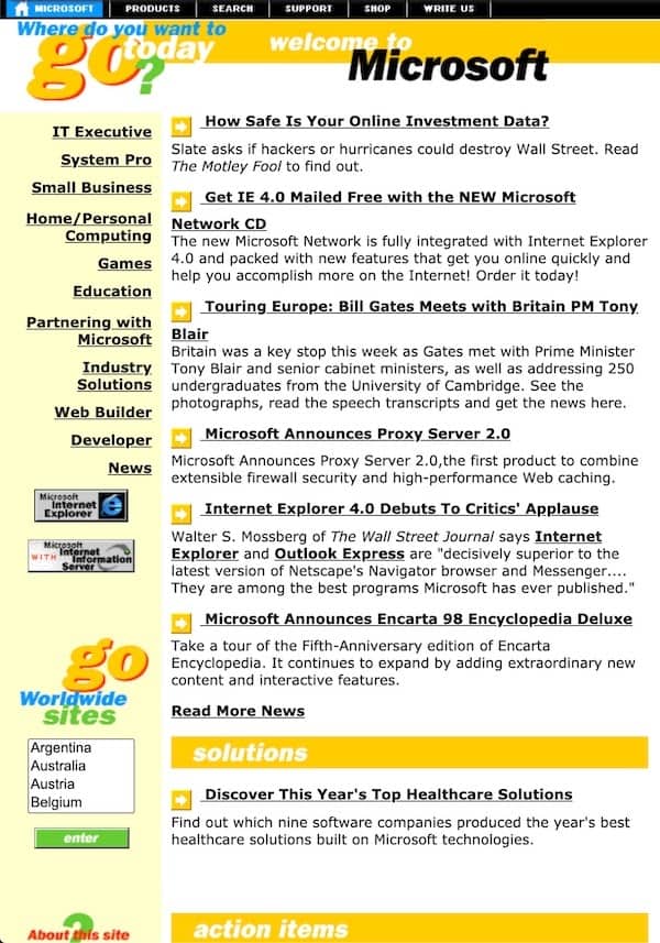
When business websites first came out; most had a massive wall of text that explained everything about the company’s product or service.

Microsoft’s website in 1997
And though this may still be the case for some business websites today, one thing is sure – you’ll only find those types of content within pages, but not on a site main landing page, right?
Now, why is that you ask?
It’s because we at xSquare believe that imagery is now at the forefront of marketing. And that a well-designed website needs to have a fine balance between eye-catching imagery and powerful CTA text to improve conversion rates.
A conversion is an action you’d like the reader to do after landing on your page. Example buys a product on the page, signs up for your newsletter, or clicks on a link that redirects to your inquiry form.
Case in point,a Stanford Web Credibility Project research paper stated that:
“46% of respondents reported that they assessed website credibility based on the overall design of the site, including elements like typography, layout, and colour schemes.”
With that said, it is clear as day that web design is no longer limited to just website layouts, but now plays an active role in increasing conversion rates.
Think of it as you would a first date. You dress to impress, and you try to steer the conversation into something that your date can relate to. If you play your cards right, then you earn your date’s trust, and maybe bag a second date.
Does that make sense to you?
How can you know if your business website doesn’t appeal to customers?
There are a lot of factors at play here, but if one of the talking points below hits close to home, then maybe you need to tweak a few things.
No web traffic
This could stem from two things. First, maybe you don’t have an active (or effective) SEO campaign. And secondly, your social media campaign (given that you have one) is not resonating with or reaching, your target audience.
If you are interested in how to create and launch an effective SEO and social media campaign, we will be coming out with in-depth articles about it in the future.
Low to non-existent inquiries
These inquiries should either come from the contact information of your website, or through your social media channels.
The lack of inquiries could possibly mean that your content is not convincing enough to make site visitors inquire about your product or services.
Effective sales content should not engage its readers, it also serves as a guide that provides suggestions, or guide readers on what to do next.
Wrong inquiries
Now if the inquiries you get sound a bit off, or may not be completely in-line with the product or services you offer, then your call to action lines, then there is definitely something wrong with your content.
Remember that the content you have on your site, be it images or text, are visual cues that explain and represent what you are offering.
Specific questions about what actually it is you do, or what your product does means that your content is confusing for your target audience.
When it comes to creating content for products or services, talking points need to be detailed and easy to understand.
Save the flowery words for blog posts. For your main pitch, it needs to convey what your business is all about immediately.
No or low conversion rates
When it comes to conversion, price plays a huge role – so let’s take that out of the equation for now.
From our experience, low conversion rates stem from:
Lack of CTA lines – which means that visitors do not feel the urgency to take action to either inquire about or purchase your product or service packages.
Bad content – which could either mean that it’s not just engaging or convincing enough.
Little to no feedback from visitors
In the age of social media, the interaction between businesses and their target audiences has become the norm.
Those who understand the persona of their audience are more likely to increase their sales, as well as brand recall and authority – even beyond their intended audience.
What brand recall you ask? It’s about how familiar your target audience is with your company. This is why multinational companies pay millions to create product ads or create PR campaigns.
The more familiar your target audience is with your brand (be it product or service), the easier it is for you to create content and advertising materials that appeal to them. Paid ads, if done correctly will cost less and highly boost sales.
Now if there is little to no engagement between your business and your target audience, then maybe you’re not sending the right message to them – and need to rethink your overall content strategy as well as come up with more relatable and responsive design elements for future content.
What are the elements of a good business website design?
To go straight to point, good web design needs to have:
- Clean but eye-catching colour scheme
- Plenty of negative space (preferably white)
- Interactive images
- Powerful (but subtle) call to action lines
- Quality and relevant videos
- Sleek backend coding
- User-friendly interface
- Search engine optimized (SEO)
- Loads quickly
As you can see, six out of the nine elements relate to visuals.
And though we’re basing this on our own experience as seasoned business website developers – you only need to take a look at the layout of multinational companies to see that visuals are at the forefront of their web design.

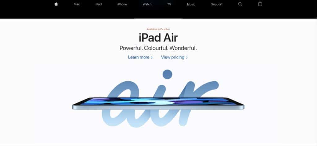
Apple Singapore website (2020)
And it totally makes sense if you want our opinion.
Why go with a clean minimalist design, with tons of empty white spaces? Because said negative spaces draw the eye towards promotional images, text, and videos – as there is no other distraction for them to focus on.
As seen in the example above, your eyes are immediately drawn to the product.
The main point here is to make your site layout “clutter-free”.
Web design clutter could either be in the form of too much text content, not being able to quickly see where to go or what to do next due to bad user interface design.
Like what was mentioned above, modern websites are geared to quickly present what it has to offer to its audience.
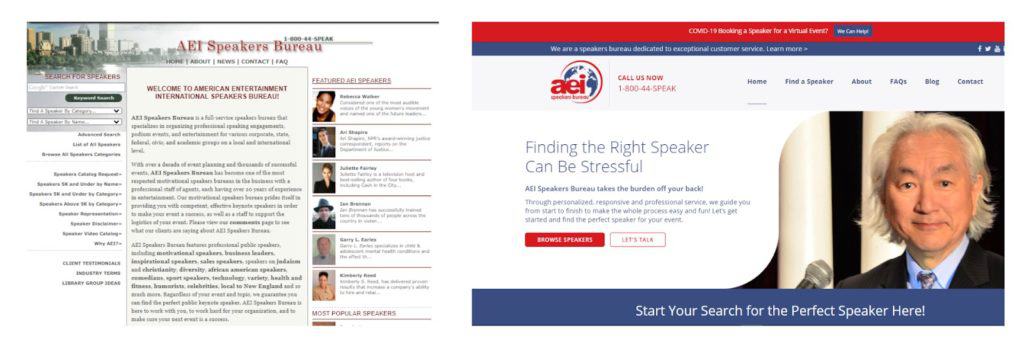
As an example, take a look at the evolution of the AEI Speakers Bureau website.

AEI Speakers Bureau 2010 website design on the left and their 2020 web design layout
By keeping things simple and direct to the point, you’re able to convey your message much faster – and more importantly, clearer.
And if you did your homework and researched the pain points of your target audience, then you can easily create custom content that is absolutely relatable to them – which increases the chances of conversion.
Of course, SEO factors are still at play – and should not be discounted.
Always keep in mind that regardless of how aesthetically pleasing your website may be, it would amount to nothing if it doesn’t rank well in the search results for specific keywords that are related to your industry.
Google, as well as other search engines, have specific rules and guidelines that websites must adhere to in order for them to rank high on their search results. The implementation of these rules and guidelines is what is referred to as SEO (search engine optimization).
A well planned and executed SEO campaign will allow search engines to rank your site/page/post on their search results – allowing for your product or service to be seen by more people online.
The better the visibility of your site in the search results, the higher the traffic – which could potentially boost conversion numbers as well.
That, in a nutshell, is what SEO is all about, and we will be writing about it in a later blog entry.
But aside from the benefits of increased search visibility by implementing best SEO practices, a positive user experience should also be at the forefront of your site’s design and layout.
Take for example your site’s code structure. Backend coding is something the majority of site visitors don’t really care about – but sleek coding can help make a website load faster, which in turn loads the website much faster for the site visitor – which ultimately makes for a positive user experience.
Anyway, going back to the article, we all have different tastes and preferences.
And though you may be nodding in agreement with everything written on here – there is still a slight chance that your take on things might be a bit different from what your business website actually needs in terms of aesthetics.
Here are a few things you need to consider in order to make your site more appealing to its visitors.
You need to make sure that:
- Your site is free of any unnecessary distractions
- Follow it up with content that forces them to scroll down.
- If you have lots of content on your landing page, try to break it into several sections and use eye-catching imagery as separators.
- Make sure to also insert CTA lines at strategic locations throughout the page.
So again you see that web design, in terms of content and site aesthetics, once again takes centre stage.
If you’re able to make even just half of your visitors click on a CTA, that could be considered as a win don’t you think?
TOP TIP: Peak at your competitors and industry leader’s website
For research sake, there is no shame in taking a look at what more successful competitors or industry leaders are doing and what their website design looks like.
We’re not suggesting that you copy their website design, but rather use it as a comparison to your own layout.
Put yourself in the shoes of your target audience and ask yourself questions like:
- Do they have a website that you’d trust to do business with?
- Is the company’s branding immediately visible through the website design?
- Are their web pages filled with just the right amount of necessary information?
- Do they make it easy for potential customers to inquire about pre-sale questions?
- Would you buy from via their website?
- How’s the placement of important information, like their business phone number and email address, and how easy was it to spot?
- Does their website look good and load fast on mobile?
In short, use their web design to come up with questions that you think would help you pinpoint what the problem areas of your website are in terms of web design.
Individually, each one of those is a factor that many business owners don’t bother much about. But collectively, all of them can quickly add up and become a liability.
Google cares about your business website design
Yes, that’s right. Google does care about your web design.
From the relevant pages on your navigation bar, the information found on your blog posts, Google cares about all of that.
Why? You ask. Because search engines are concerned about providing their users with quality content too.
And when we say content, it’s not just images and words, but rather the entire user experience.
As a business, Google’s selling point is the idea of being able to give value to its users. And that’s why we earlier mentioned the load speed of your site, and if your site is search optimized.
For example:
- Do visitors to your site need to constantly pinch site pages in order to read what’s on them?
- Does your site have a few broken links that have been on there for quite some time?
- Is navigating your website easy, or do you need time to figure out where to go next?
Though two of those may be linked to SEO, it’s still part of the greater web design umbrella. And the more complicated things on your site are, the lower the quality of your site is in the eyes of Google.
When we say Google cares about your web design layout, we don’t mean that they’ll give you a call and tell you what they don’t like.
They will definitely reach out to you, but that would be through the search results – a low grade for the site on the SERP (search engine result page) to be more precise.
In layman’s terms, your website won’t get much traffic from Google because your site is not ranking or does not appear on the first couple of pages of its search results – for keywords that are highly related to your industry
It’s as if your business and its website don’t exist.
Like what we said earlier, Google, as well as other search engines are concerned about the browsing experience of their users.
And if navigating your site does not make for a positive user experience, then why would they want to help boost your online presence?
Quick ways to immediately boost business growth
As a rundown of what you need to do in order to not make web design a hindrance to business growth, remember to:
Create a website that is free of clutter – in order to make it load much faster, and quickly show visitors what you have to offer.
Make sure that your website is mobile-friendly – as this is how most people access the internet these days.
Your web design must be geared towards the customer – meaning that your entire website layout, as well as its content, needs to be clear, informative, relatable, and engaging.
Make your site easy to navigate – this means that important information needs to be clearly visible and accessible.
Create an aesthetically pleasing website – that is filled with eye-catching images, great typography, and easy to read articles.
If you don’t have the time to personally do all of the things we mentioned, or prefer using a web design studio that can help your business grow with better website design, then all you need to do is send us a message.